Gm frENS ✧
Excited to share a new addition to our voting visualizations - an interactive chart to explore Copeland voting outcomes!
It was challenging to solve, but we stuck to our core principles of clear, clean, and traceable charts which guide all of our data visualizations.
And here’s our solution:
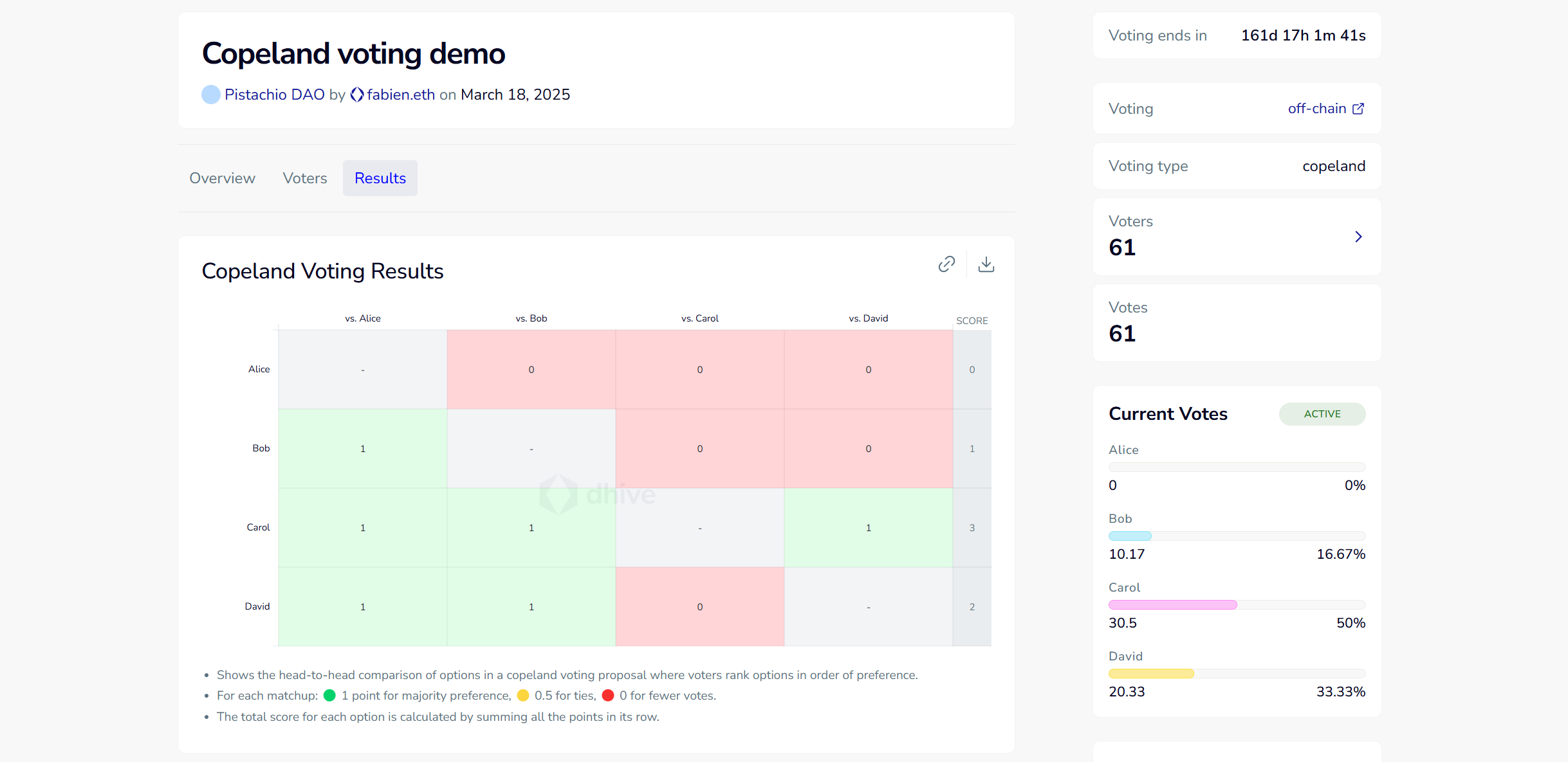
⟐ Pairwise comparison chart showing how each option scores in head-to-head matchups
⟐ Final scores are marked to highlight how they are calculated across all comparisons
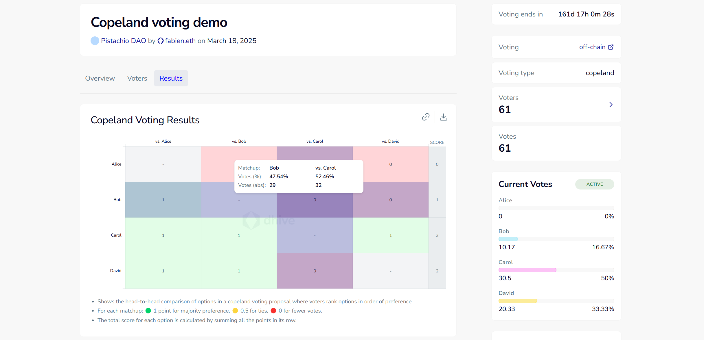
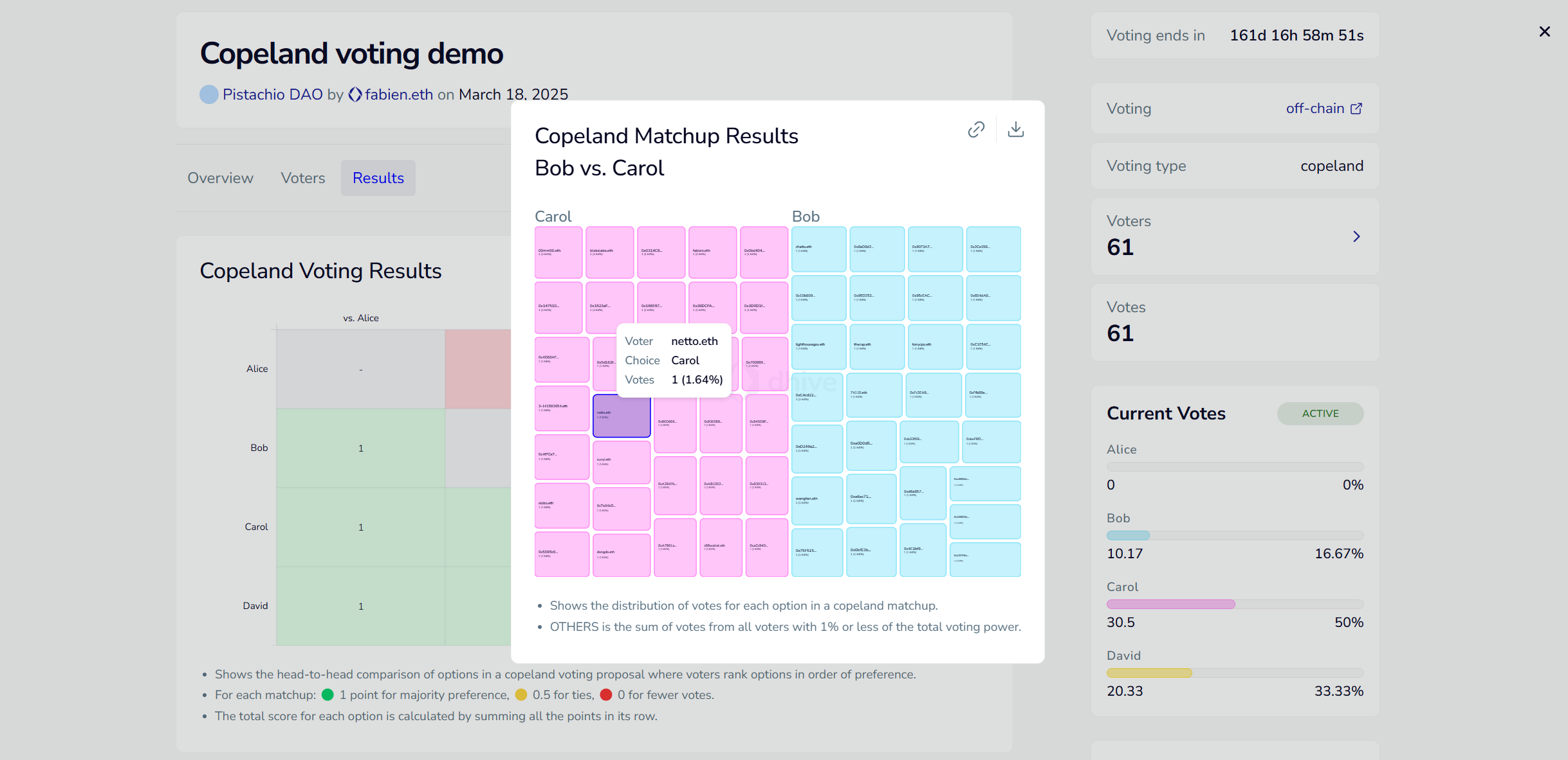
⟐ Viewable votes distribution of any matchup by clicking on the score to reveal it
⟐ Designed to complement platforms where scores are shown but the logic behind them isn’t
We wanted to be ready for the upcoming proposal using the Copeland voting method and help bring more transparency to how voting results are derived.
As always, feedback is very welcome.
Thank you & happy voting!