Inspired by this Twitter conversation, here is my feedback based on supporting user issues day today.
Would be great if whoever considering the redesign take these into consideration.
I am aware that some of the problems/solutions are beyond the scope of UI redesign but put it there as it is likely to influence the new design.
Hard to register
This is the number 1 support request within our Discord support channel. We have made various improvements over the last 6 months but we are still getting these support request.
- Users don’t complete the whole step within 24 hours then the step gets reset.
- Users refresh the page and send transactions multiple times at step 1 before the transaction confirms leading to many failed transactions
Even though I understand the need of 3 steps model in theory, I wonder how effective the process is.
Users are not aware that they have to complete the second transaction (step 3) within 1 min to prevent front running so chances are the majority of new name registrations are already front-runnable, but no one does it or we don’t have a way to measure that.
I wonder if it’s better to get rid of this 3 step registration unless the prices are in premium (implying it’s higher value).
How to use IPFS+ENS?
- We used to have IPFS cloud integration but that has been disabled as the integration has been broken. The current UI has no indication/hint of how to set these up.
Confusing concept of “name ownership”
- There is no explanation of “Controller” and “Registrant” unless you see FAQ page.
- Transferring ownership requires 3 steps (Change the record, change controller, then change registrant) but that is not explained anywhere nor intuitive.
Changes made after the initial release.
- “Connect” button is added when we did wallet connect integration but the button is not visible on the home page on mobile view.
- “Set reverse record” was moved from /name page to /address page, and some people find it difficulties finding the UI as the link colour is grey.
- “Add/Edit” record is a link which is less visible than other buttons (transfer registrant, set controller, set resolver, etc), so people continuously ask how to change the address.
- “Learn how to manage your name” used to expand when users haven’t set resolvers. Now the resolvers get set on registration, the page never expands hence most people don’t notice the change.
Unused design/unnecessary
Integrating subdomain registration (aka now.ens.domains) has been in our roadmap for a long time and we created a search page to handle both second-level domain and subdomain search.
However, the subdomain registration has constantly de-prioritised hence it has less value or rather confusing.
Support for old features
- Non-public resolver is not editable = If names don’t have the latest public resolvers, we currently urge users to upgrade, but it should still be editable where possible.
Increased gas cost and ETH price making people more sensitive to the gas cost
- When we batch some transactions (eg:
registerWithConfig which combines 3 transactions, multiCall to update multiple records in a batch), that would increase the overall gas cost so some people request to expose the option not to use these features to save gas.
I very much like the clean design that we now have on https://ens.domains/ and https://app.ens.domains/ , well done so far!
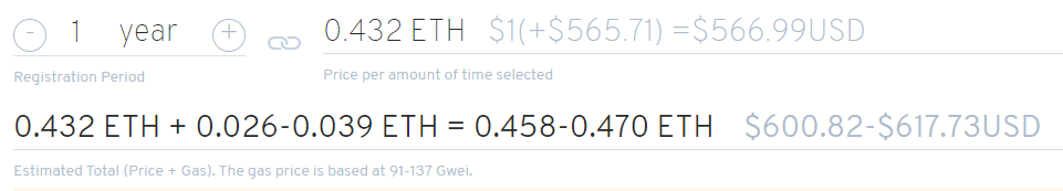
What I recently came across is when you try to register a name with a temporary premium, you’re flooded with information (please see screenshot). I think this information is supposed to make the price transparent but it might scare people off 
Thanks for the feedback, we only added the second part (estimated total) last week because so many people complained that they didn’t know how expensive the gas is in total (with step 1 and 3) before they make the first transaction (step1). It’s a similar feeling that you don’t know how much gas it takes to yield farm before you ape in because you have to go through multiple steps.
I could only show the USD value but that’s also misleading as users have to actually pay in ETH (of the USD value). Maybe moving the second line to confirmation modal may make it cleaner but probably that may still scare people off as we are giving the same amount of information. Cleaner yet informative UI suggestions welcome.
Or maybe we can get rid of/hide the breakdown of price and gas (0.432 ETH + 0.026 - 0.039 ETH) part as people can figure it out by themselves.
Jup, I actually saw where this information came from (I mean, why you integrated this) - I actually thought twice whether I should point this out as you just implemented it…
What would be nice from my perspective would be the following: You just see one number/one price (or maybe price + gas cost) and then you have a button (“How is this price calculated?” or something like that) that toggles a side menu with the full explanation of the price. That’s virtually the same information wise but looks not so scary. (It’s the same like on certain registration sites where people just enter their email and in the next step enter more information. It “feels” a bit less exhausting than seeing all the information immediately I would say.)
PS: In the calculation itself it seems like we have +/- (plus/minus) signs and hyphens that denote a range. If this is the case, that’s also maybe a bit misleading.
Hi, I’d suggest using a rough estimate instead of ranges for displaying gas price. Eg. 0.432 ETH + ~0.032 ETH = ~ 0.464 ETH for example. Or let’s say approx. 0.464 ETH as the minus sign along with the lengthy display makes it confusing. I’d also consider a font style weaker in color and size than the price w/o gas.
Regarding subdomains I still think they have great potential using them in a way like userid.coinbase.eth for exapmle. And for comparison, despite bad SEO and inferiority, many are still seeking cheap alternatives to SLDs too. Just give it some time. However, now.ens.domains having a completely different UI just makes things uncertain I’m afraid; app.ens.domains should be the only place for registering imho.
I agree that fighting increased gas cost could be done by allowing advanced users to choose how they want to register the domain - though the 3 steps model rarely if ever worked in the way it supposed to in my experience. After testing it a few times on Ropsten it seemed like the first to complete both transactions wins, no matter what. The same way I lost a domain on mainnet; the prompt for the second tx just wouldn’t show up and I saw the domain got registered already as I refreshed the page.