Loving the look of this design and the simplicity of it. Clean interface and the landing page reminds me of the minimalism of Google, works very well.
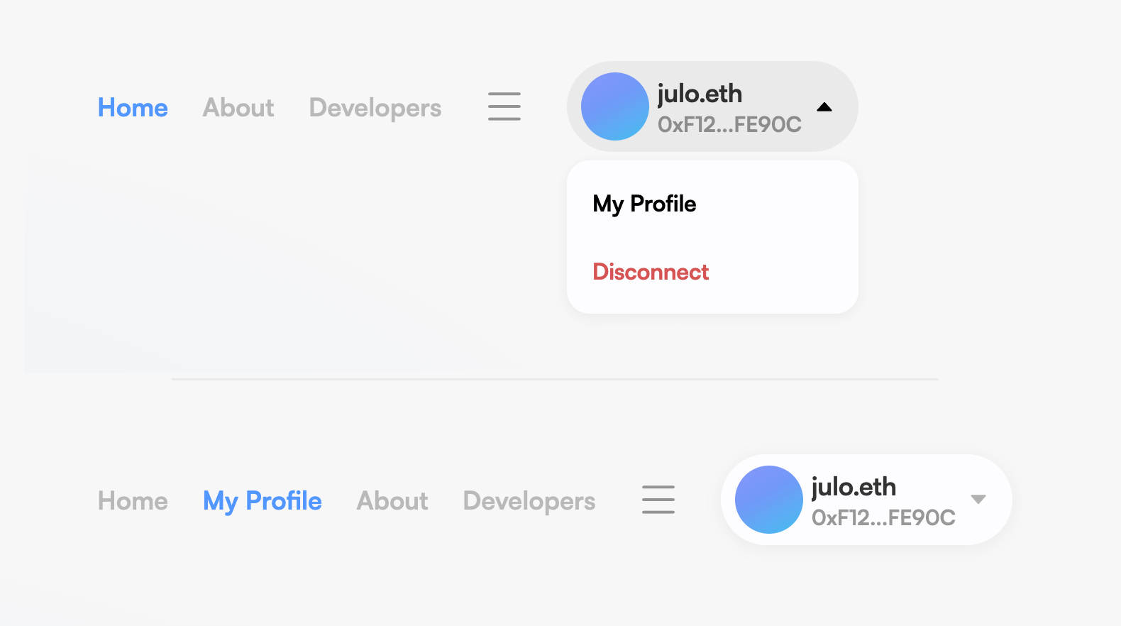
Probably a minor point but when connecting to the site, the “My Profile” link is located in the dropdown, I was thinking that this could be moved into the main navigation after connection. My thinking behind this is that although there will be users wanting to search and get a ENS name, many users will already have them and want to check their own settings - it’s not hard to find but it is an extra click.
By moving it into the main menu, there is a more obvious state change and users can access their profile from the main nav as opposed to clicking into dropdown then ‘my profile’ every time.
There is also a more general point about calling the search page home because you could argue that users might consider their own profile home? Search might be a more appropriate name for it but just an opinion.
Edit: Clicking the ENS logo could be used for home which is a common pattern across websites.
Sometime relatively soon, this feature is pretty high up the list for implementations.
Thanks for the feedback. We’re still implementing other pages which might have a higher priority for a user than their profile page (theoretically). However will definitely take this into account. It really just depends on how much people are willing to view/edit their own profile, which might be more/less than we are expecting.
You will find that the avatar doesn’t show because the url for it (https://www.avneet.info/avatar.jpeg) gives SSL error. This is however untrue since the SSL is issued for the domain (by GitHub); you can check this by removing the host ‘www’ from the url and the resulting url resolves fine (https://avneet.info/avatar.jpeg). The issue here is in the way GitHub issues SSL certificates; the host ‘www’ needs to be specified if SSL is to be issued for www hosts alone. I tried this but it has a decent documented failure rate depending on the DNS provider. It is suggested to skip ‘www’ when issuing SSL via Github.
Workaround: Catch statement for SSL errors and try re-checking the url without ‘www’ (if present).
(I can open a pull request if you want. Git repo?)
I don’t think that should be fixed as that’s not a bug, it’s working correctly. Hostname verification is an important security mechanism to ensure that the request URL matches the subjectDN of the cert or any subject alternative names in the cert extensions.
I don’t think the UI should be changing the URL a user provides. At most, maybe it could give a warning to the user when they are setting their avatar, like “Hey I noticed the SSL cert was invalid because of these reasons, please check your URL to make sure it’s correct”.
In this case, the user should have set https://avneet.info/avatar.jpeg instead I think.
Looking back at this thread, I’d been kicking around the idea of the DAO funding some IPFS nodes, similar to the idea of the community identity server we’re undertaking.
Even if we only began with a scope that include ENS avatars, there would be tremendous value in streamlining the user experience and keeping ENS avatars pinned. It could be as simple as this new frontend page offering an avatar upload flow that would pin the image file without the end user ever having any idea what IPFS is.
Seems like a fantastic use of DAO funds to enhance the ENS experience.
@inplco or @serenae - you two are both pretty fluent in IPFS, any pros / cons that would be worth discussing?
I think ENS already has its own IPFS gateway if I am not wrong, although it hasn’t been utilised in the manner that you mentioned (as far as I know). There are no cons to it I think. I have seen @nick post links with ENS gateway although I might have to dig a bit to find them
I don’t know if ENS has it’s own gateway or nodes, but I do know that the ENS metadata service just uses the ipfs.io gateway URL when it serves up IPFS avatars.
First thing to do: Make uploading avatars as easy as possible.
Should be as easy as it is in any social media site you see like Twitter/etc. Choose a file from your computer, opens up a preview screen where you can crop it / etc so it’s square, all that stuff.
Then the next question is, when a user uploads their own avatar, how do we store it?
To start with we could use some hosting service or whatever TNL is currently using. But a better and more decentralized/web3-ethos solution would be to upload to IPFS.
The end-user should not even need to know what IPFS even is. They just choose the image from their computer, and ENS takes the wheel.
I will recommend Arweave for permanent store of avatars. Fee for a jpeg will be tiny and it avoids all the IPFS hassle. Simple upload as far as user is concerned and it can be built into the UI. The only issue is paying in AR for the upload which will need to be swapped from ETH over some L2 behind the curtains. But this is a headache for the dev and not the user. I have used this system on Metaplex and it works great! RFP?
I don’t think it’s necessary to directly fund independent IPFS node hosting since paying for a service like pinata is pretty cheap.
As long as there is a compression pipeline before the upload, each avatar would be approx. 500kb. Given this, and knowing that around 25k ENS names have an avatar record set, if every record were stored on pinata it would cost around $1.85/month.
This is definitely the plan, and will be a feature in the full release of the manager redesign.
Yes, this is currently an option in the ENS manager. Go to your name’s page in the app, connect your wallet, and press “add/edit record”. You’ll see a “description” field under “text records”. This allows any developer to access your records like eth.xyz, gweifundme, and more. It’s your portable web3 profile!
While you’re at it, I also recommend setting some other records like avatar, twitter, etc. as you see in the post you replied to from defidaniel.eth.
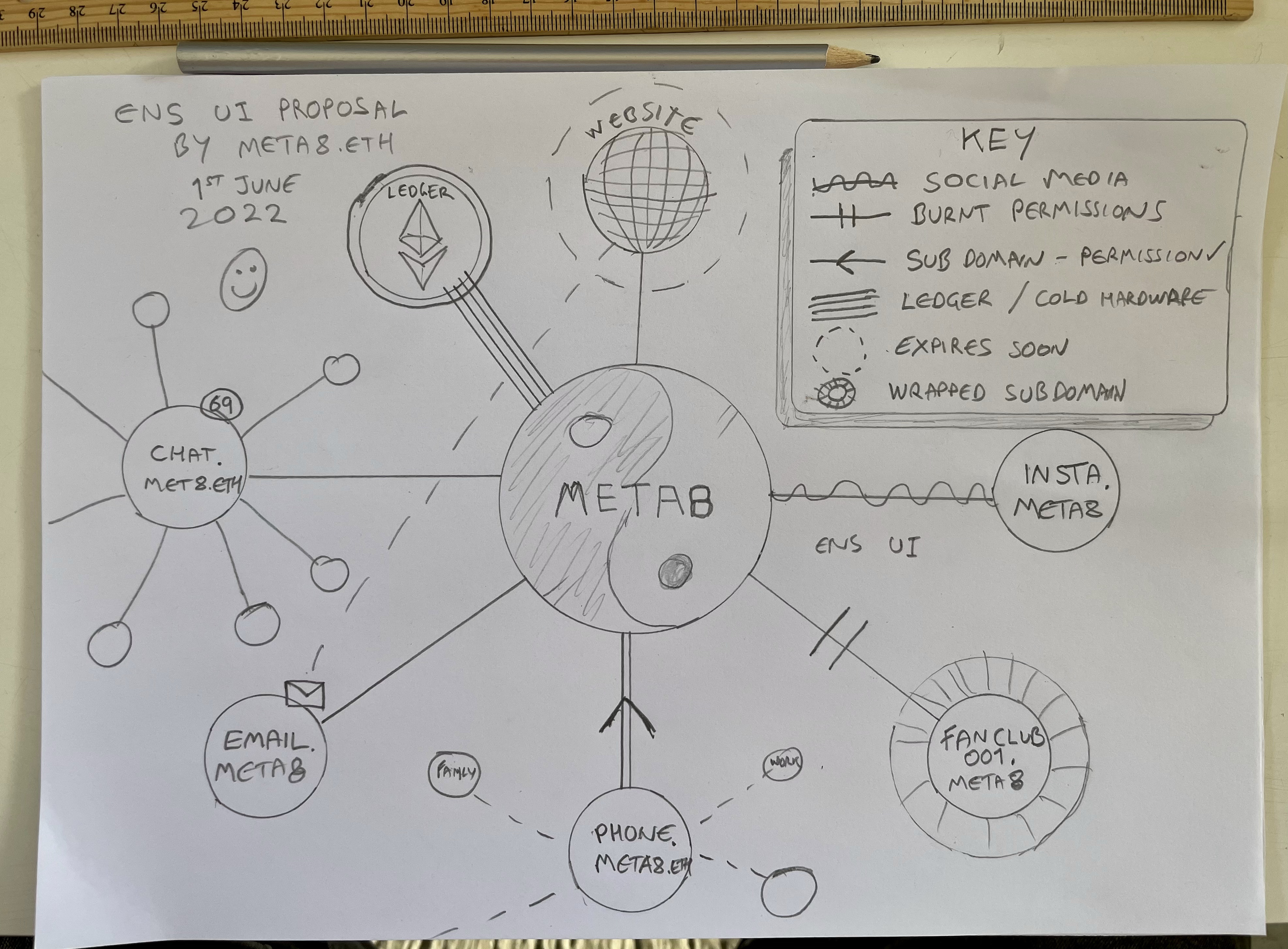
My idea for a major UI overhaul to allow for a broader visual understanding and management.
I can imagine this being used simply to begin in a 2D webpage / dapp. As well as future integration with AR and a 3D “Tony Stark” like interface where by we/the user can bring up all of the subdomains and quickly and clearly see what connections they have as well as, notifications, pfps subdomains built specifically to link to a centralised/personal server that would serve as a sort of Web3 Widget - ie weather, still image of a webcam feed, Ai art that evolves everyday.
This is just scratching the surface of what I believe can be built around the already existing frame work…


