This is idea came to me during the Community Working Group call today (25/02/2022), looking for support and ideas from your all.
Some of us are visual learners and I have been following the expansion of the DAO into the various Working Groups and the sub-groups within these Working Groups.
Super exciting times, but hard to follow all the new sub-structures and who is who within them… so here is a proposal to create an organigram / Organizational chart of some form.
A visual representation of the DAO in its current structure that shows the current Working Groups and the sub-groups within… giving a visual high-level overview of the DAO.
Some features I am considering just now:
- There within there could be the listed names of the Stewards for each Working Group.
- A dynamic image / tool would be good, as these are evolving at this time and will continue to evolve (as Stewards change but also the overall structure).
- There are interactive tools that have been created within the holocratic/horizontal organisations (roles and domains) and so we don’t have to ‘reinvent the wheel’
- Potential also to have TNL connection included so it can be obvious the distinction between the ENS DAO and the TNL company.
- Facilitation of on-boarding of new users especially for visual learners like myself.
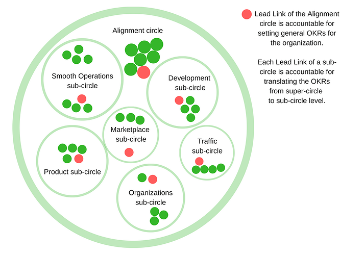
Example of a holocracy ‘circles’ visualisation:
<image credit: https://blog.holacracy.org>
