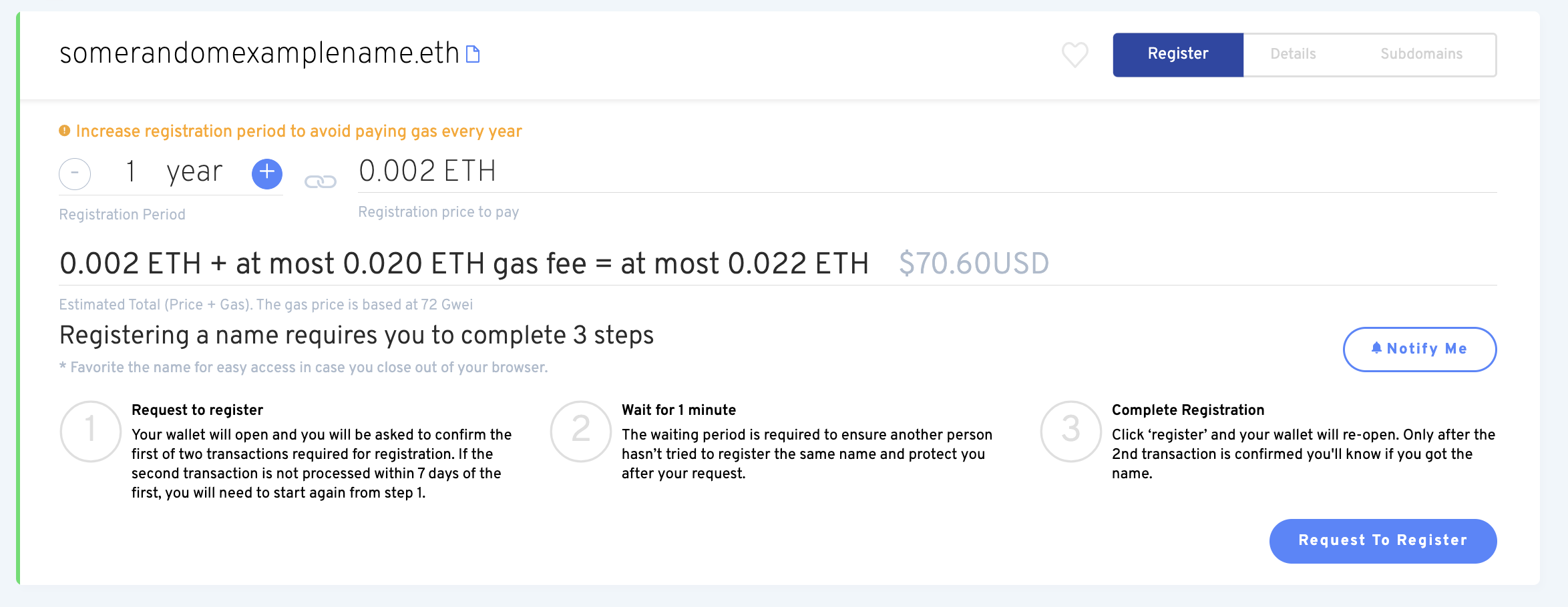
We have an alert saying that you should increase registration period. If that choice is wrong, why is it the default? Never force users to read unnecessary alerts.
Registration pricing is confusing. It’s shown in eth, the summation is done in a single line and only then the total is shown in dollars. I don’t know about you but I have a hard time adding stuff in my head with 3 decimal cases.
All the information about the 3 steps required to buy a name is confusing. It’s not necessary to show that to the user now. It makes the UI crowded.
The current price/gas ratio is ridiculous. Users will often be paying $5 for a domain and $40 in gas. The default suggested term is still 1 year and we alert the user about it but the reality is that if you’re willing to pay $X then at least half or more of that should go towards the product itself.
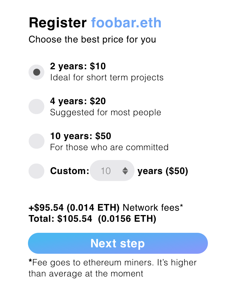
Many users don’t like the idea of having to renew something and are attracted to the model of “Pay once, forget it and own it forever”. While we can’t (and shouldn’t) have a “forever” plan, for most users a long time range of 5 or 10 years is effectively forever.
Defaults are powerful design tools and we should use them. Showing them set expectations: do this if you are starting. do that if you want to be on the long term. Custom still allows you to buy a name for 1 or 100 years, but it’s not the default anymore
Network fees are shown separate in both dollar and ether. We should have a color alert when the gas is extremely high saying something to the effect of “Gas are volatile, you may come back later and buy it for lower”
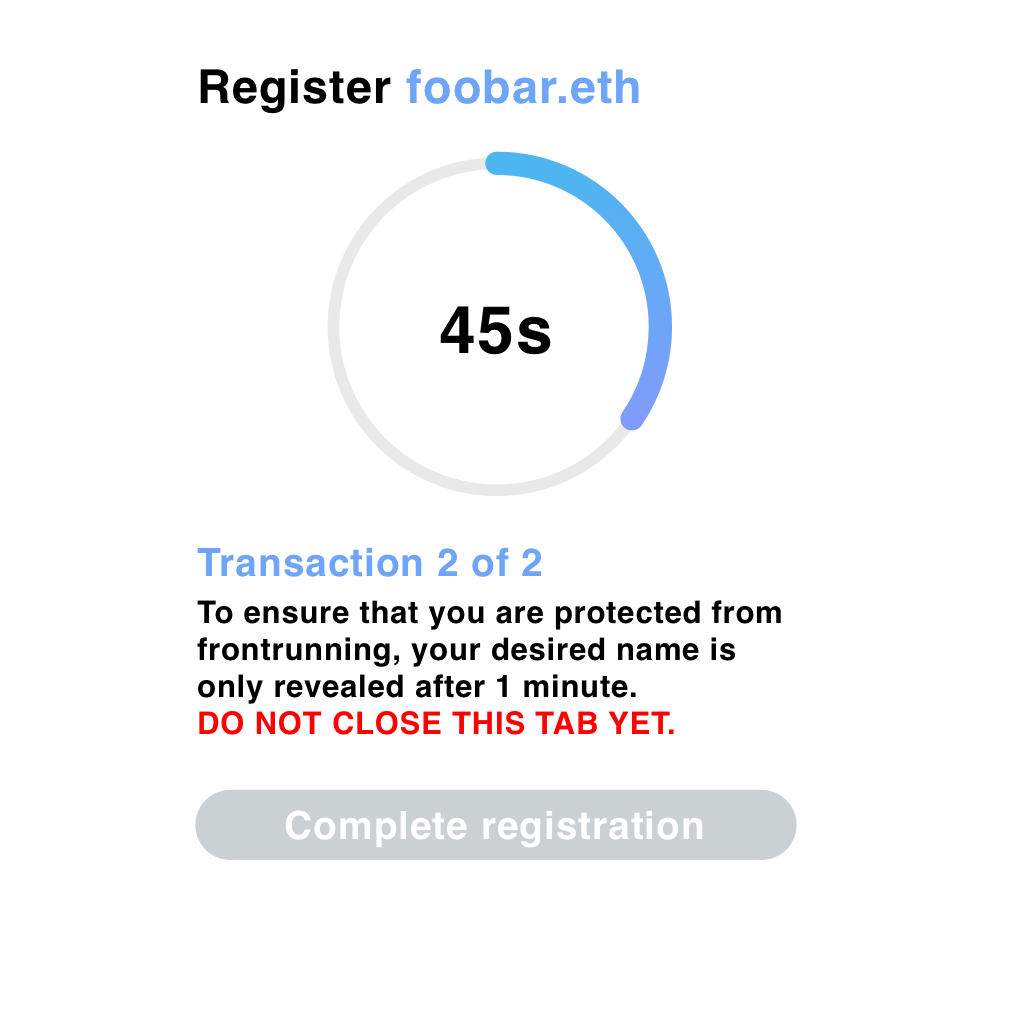
All the “3 steps to buy” information should be at a later stage, presented slowly.
This is a first draft on how they could be presented:
Ideally we should work on the backend to eliminate those steps. Can we add an option to ask the user to have the second transaction as a simple signature that the frontend can post by themselves? If the user can trust our frontend not to frontrun them (which they already do, since we could be buying names as users search for them), can we eliminate that second step completely by allowing anyone to make the reveal?
The process is actually a two step process, not 3: it’s just that there’s a mandatory waiting period between 1 and 2. Saying it’s a 3 step process makes it seem more complicated than it already is.
This is definitely a big improvement on the status quo.
We actually did a/b testing on the registration period - we tried defaulting it to 1/5/10 years with a message reminding people to check it. 5 worked very well, but there was discomfort in the team that we might be misleading people into registering for longer than they intended if they weren’t looking closely, so we settled on the warning - which did have a measurable impact on increasing mean registration period.
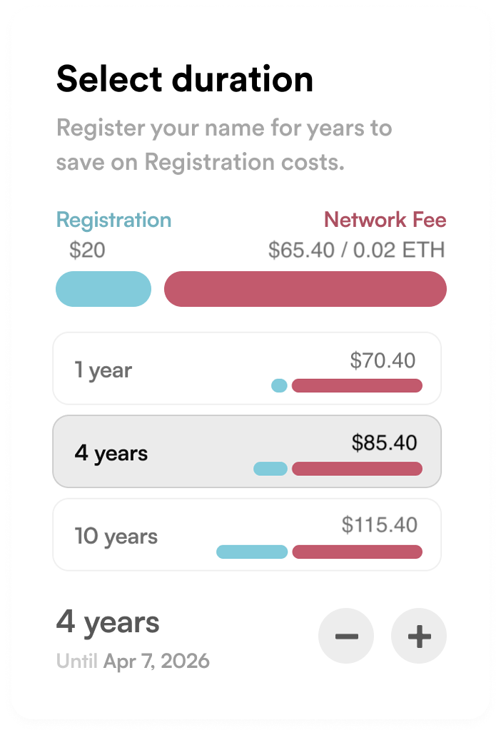
I like the idea of the list - though I wonder if it should incorporate gas prices in the total? A list that looks like this would definitely change how people think about registration periods:
1 year: $105
4 years: $115
10 years: $145
I think the frontend team may already have a new design that addresses some of these issues - @taytems@jefflau.eth@Leon is there anything you can share?
It’s hard to include a lot of information like your example suggests without totally overwhelming a regular person, we can partially get around this though by having tooltips on most things with explainers.
In terms of showing the steps to the user, we still want to show the basic outline of the registration process without delving into details immediately. Don’t have a fully up to date design to show right now for that though.
Yes, every design decision is some sort of manipulation. But leading users to outcomes that we believe are better for them is not a dark pattern. If anything I think registering for a single 1 year is an overall bad experience for a user since it’s not that much of a price difference anyway and we should only offer that option if the user explicitly goes for it (just like there’s no 100 years option)
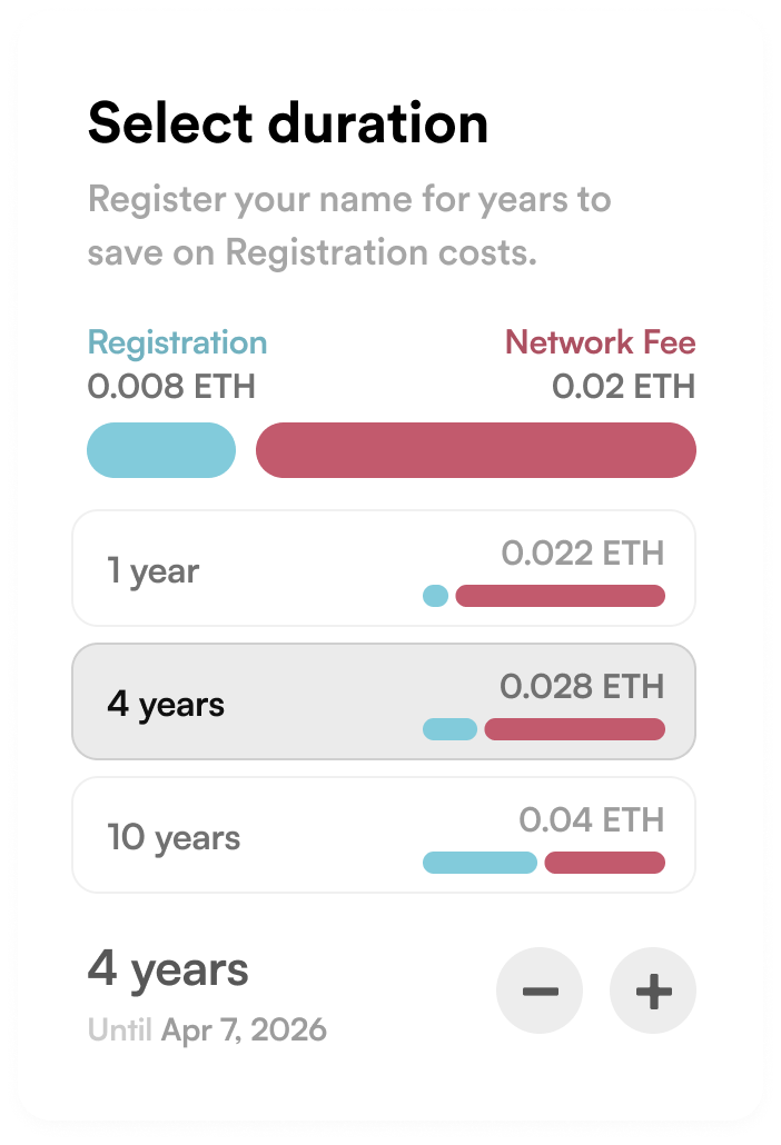
Indeed this helps show the point that adiding more years doesn’t affect that much the overall price, but I prefer to keep it clear what money goes to ENS and what goes to ethereum network fees
I agree, lots of tooltips will be super helpful. Great job everyone so far on the design changes! Looks
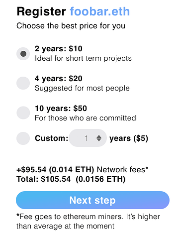
Love this It doesn’t feel like it’s pushing the user to register for more years, but giving some choices. My only suggestion would maybe be for the Custom selection to begin at 1 year ($5) instead of 10. Visually this would let the user know that 2 years is not a minimum(the top default choice), and that they can easily set any amount of years, even just 1.
I like Alex’s version, it’s easy to read. Ethereum fees, while surprising to some, are mostly understood, so will only trip up a very small number of users. I think it is fine to start with 3 years instead of 2. $15 is a good price, and probably three years is the right amount of time for most users.
Tate’s version is super elegant and probably more translator friendly.
We should default to dollars for the renewal since that’s how it’s priced, and maybe the totals as well. Or just use the standard “Show in $ or ETH” toggle.
@taytems - Would it educate on the components of the transaction better if your bars showed a consistent length for the network fee? Something like this? If so, it’d absolutely get my vote.
I like the colored bars on the total. I think that if we simply animate them when the user makes a new choice, then it will not be necessary to also have the colored bars on each. The layout would be cleaner.
I like AvsA’s version when compared with Tate’s. Certainly a point to guide users through increasing the registration option and I believe 1 year minimum, 3 year regular, 5 year advanced 10 year maxi might be helpful to guide some users.
I agree with @5pence.eth that we should have a $/ETH toggle and the math is much easier, but may not be helpful for those not transacting in USD.
I think the coloring and bar graphs in @taytems can be a bit confusing for users not paying too much attention. The visualization causes your eyes to gaze two different price points, and do math in your head. I’m surprised I’m the minority with the coloring bars, but maybe I’m just the voice of the Normie!